An exploration of expressive, performant typography
Web typography
A brief history
Rich typography has for years been the envy of many web designers, who long for the typographic variety, texture, and precision available in print media.
The first huge stride in typographic detail on the web was the introduction of web fonts, which allowed designers and developers to use many other fonts besides the handful generally available on user’s operating systems.
Why were web fonts so exciting for designers? Jason Pamental put it eloquently, “typography is communication” but currently the web is “all system, no soul.” Web fonts teased the opportunity of bringing that “soul” to the web. Unfortunately for web fonts, to provide this soul, it comes at an especially important cost.
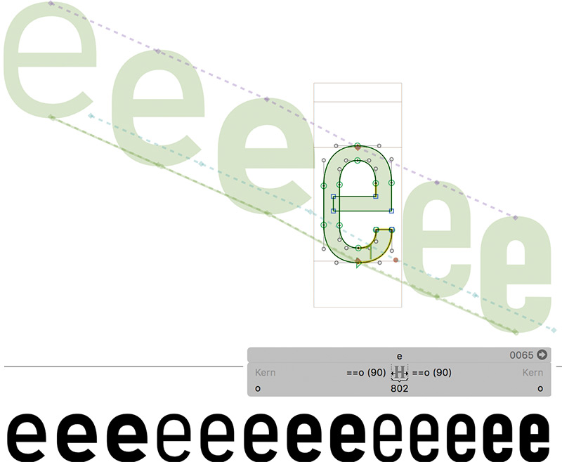
Multi-type quotes like this used to only be performant in images or SVG; until variable fonts. View this pull quote code on Codepen
Delivering this “soul” using web fonts with regular OpenType fonts required web developers to include every different font file for the various font variants the designer chose. Take the following simple example:
1. This sentence is composed from three different non-variable font files.
To achieve the look in the previous sentence we had to download three different font files. As a result of needing to download every type face, web developers quickly found that for every beautiful font that a designer added to a site, it had a noticeable impact on the performance and overall experience to the end user. To help surface potential perf impacts, font services such as Adobe’s TypeKit have added in heuristics to warn web developers about the size and number of requests in their font selections.
Enter variable fonts
Similarly, many web developers have advocated a return to system font stacks, prioritizing performance over brand cohesion or design differentiation. Performance has the potential for major impact on user experience and a business’s bottom line, and so the web community needed to figure out how to balance this priority against the desire for beautiful typography.
To help solve this problem, one of the most impactful changes was made to the OpenType font format in collaboration by Adobe, Apple, Google, Microsoft and others. The solution was to enable font designers to provide various axes that could be adjusted dynamically by the software rendering the font, such as a web browser.
To show the beauty of this simple, but powerful capability; let’s achieve a similar designed sentence as our previous example, but this time using a single variable font.
1. This sentence is composed from three different non-variable font files.
2. This sentence is composed from one variable font
Using variable fonts
font-variation-settings
So how exactly did we achieve the seemingly different typefaces in the, previous example, with a single font?
We utilized the variable font, “Bahnschrift” by Microsoft, and pivoted the various axes to match that of sentence number one. To adjust an axis in CSS, you can utilize font-variation-settings, like so:
font-variation-settings: normal | [<string> <number>]#
For example, all of the following are valid values for font-variation-settings.
font-variation-settings: "wght" 400;
font-variation-settings: "wght" 400, "wdth" 80;
font-variation-settings: normal;
Adjusting multiple axes
If you want to adjust multiple axes on an element, you can do that by listing out axes separated by a comma. For example, the “Variable Tides” company name on this ticket has both a weight and a width adjustment:
.ticket__co-name {
	font-variation-settings: "wght" 500, "wdth" 75;
}
Reserved axis tags
While font designers can create as many axes as they desire using whatever
four-character tags (eg: 'wdth') they want; there are currently five reserved axis tags.
| Reserved axis | Used for |
|---|---|
ital |
Italic |
opsz |
Optical Size |
slnt |
Slant |
wdth |
Width |
wght |
Weight |
Wait, what? Now we have to manipulate a font’s weight using the ‘wght’ axis rather than using the font-weight property? Using the font-variation-settings property is just one method of controlling variable axes. These reserved axis tags can also be manipulated by familiar CSS properties:
| Reserved axis | Font property equivalent |
|---|---|
ital |
font-style: italic |
opsz |
font-optical-sizing |
slnt |
font-style: oblique + angle |
wdth |
font-stretch |
wght |
font-weight |
Because of this, the following two CSS declarations will produce identical results:
.someClass {
  font-variations-settings: "wght" 300, "ital" 1, "slnt" 45, "wdth" 50%, "opsz" 25;
}

.someClass {
  font-style: italic;
  font-optical-sizing: auto;
  font-size: 25;
  font-style: oblique 45deg;
  font-stretch: 50%;
  font-weight: 300;
}
Animating axes
Now that we’ve covered what variable fonts are and how they can be used, it’s important to note that they can also be animated and interpolated. You may have noticed as you scroll down this page that the section headings animate in scale and font weight as they scroll into view; this is a very practical and compelling use case for variable fonts. If you're curious how we did this - take a peek at the Codepen.
One thing to keep in mind when animating axes, according to the spec you can interpolate between two declarations that are “like”. So what does this mean? The following animation will not work:
from {
  font-variation-settings: "wght" 300;
}

to {
  font-variation-settings: "wdth" 80;
}
The reason this doesn’t work is because the engine doesn’t know what to interpolate to: does it keep “wght” at 300 or interpolate it to 0? We need to have all the relevant axes represented so the engine can interpolate them, or in the words of the spec—make the declarations become “like”:
from {
  font-variation-settings: "wght" 700, "wdth" 100;
}

to {
  font-variation-settings: "wght" 300, "wdth" 80;
}
We took this ability to animate variable fonts and had a little fun with some of Decovar’s astounding 15 different axes to create this animation:
Using variable fonts
font-optical-sizing
In a font of standard construction, the same weight across varying sizes can look inconsistent. A light weight might feel too wispy at a caption size; a bold weight commands a little too much attention at heading sizes, or it looks clunky at a particular size. To help ensure that these weights carry a consistent mood and bar of quality across sizes, some variable fonts support an axis called optical size. This can be controlled via the font-optical-sizing property. It has two values, auto and none. This is similar to what has been done in the printing industry for years.
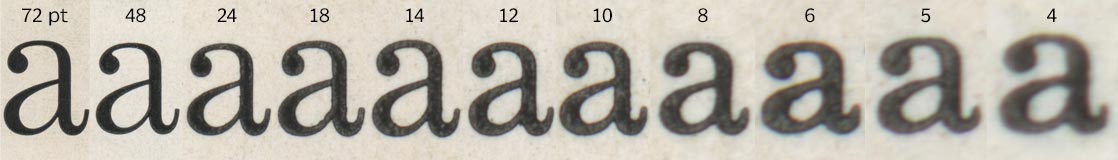
In fonts with automatic optical sizing, this optimization comes for free, as auto is the initial value. Sitka, a variable font created by Microsoft, automatically adjusts text between sizes 6pt and 36pt, such that across this entire range, small optimizations are done to make sure the type always looks its best. This behavior can be toggled using font-optical-sizing and setting the value to none.
| Automatic optical sizing | font-optical-sizing: none; |
|---|---|
| Abcdef | Abcdef |
| Abcdef | Abcdef |
| Abcdef | Abcdef |
Design tools
You may be asking yourself, “Ok, so if I’m using a font that has axes that aren’t reserved—how do I know what they’re named in the font to control them via font-variation-settings.” That’s a great question. Luckily, common design tools and operating systems are stepping up to fill this gap. Here are just a few ways you can inspect variable fonts for use in your websites.
Adobe Photoshop and Illustrator in Creative Cloud 2018
For those who design in Adobe products, an update in CC 2018 allows you to modify the variable fonts right where you normally build out your compositions. To do this:
- Select a text block that is using a variable font, in the typeface selection menu, variable fonts are labelled with the
 icon.
icon. - In the Type panel (which you can get to using Window > Type > Characters), you’ll see that it now lists out the various axes of the variable font (in Illustrator you need to click the
 icon to open up the window that contains the axes sliders).
 - Adjust the various axes sliders to update styles in the selected text block.
An example of using built-in variable fonts controls on the quote by Jason Pamental in Photoshop
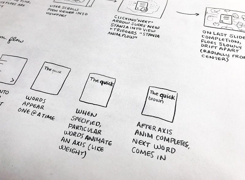
Good ’ol wireframes
No matter how many tools come out, sometimes it just helps to sketch out ideas while you’re in a room brainstorming. That is exactly what Melanie and Greg did while coming up with the various ways to show practical and exciting ways in which Variable Fonts can improve a site.
We then took these wireframes and moved into Adobe Illustrator and built them out, and then while coding it up we kept the spirit of the design in place while still making subtle tweaks. Our sketch shows the initial introduction of the poem that sets the theme for the entire expedition.
Shipping today
Browser support
When EdgeHTML 17 ships, all modern desktop-based browsers will support font-variation-settings, except for Firefox, where it is behind a flag. On mobile, currently, Chrome and Safari 11.2 will support variable fonts, but UC Browser and Samsung Internet do not.
At time of writing, only EdgeHTML 17, Safari 11 on MacOS, and Safari 11.2 on iOS support font-optical-sizing.
Progressive enhancement
As you can see, support for variable fonts is beginning to make its way into browsers as well as into fonts, so it’s wise to use variable fonts in a progressive enhancements manner. To see if a browser supports variable fonts, utilize the CSS @supports conditional check, like so:
@supports (font-variation-settings: "wght" 500) {
	/* variable font code here */
}
While this will check if the CSS parser understands font-variation-settings, it doesn’t necessarily ensure that the correct font is being selected. Take the following example:
font-family: "Bahnschrift", sans-serif;
font-variation-settings: "wght" 600;
This will result in users utilizing a Windows 10 device with the desired result, but unless you are providing a fallback copy of Bahnschrift from the server, anyone accessing your site using a different OS will render without any axis change. Because of this you should provide fallbacks and only utilize font-variation-settings for non-reserved axes so that no matter the font they’ll be styled similarly. For example a better approach would be:
font-family: "Bahnschrift", -apple-system, BlinkMacSystemFont, sans-serif;
font-weight: 600;
This will ensure that if the user is on Windows, Mac, iOS, Android result in grabbing their respective variable font. When using this approach however, you need to ensure that your design doesn’t depend on certain font metrics. If your design does depend on certain font metrics or a non-reserved axis then you should serve the font using @font-face, like so:
@font-face {
	font-family: "Decovar";
	src: url("fonts/DecovarAlpha-VF.ttf");
}

body {
	font-family: "Decovar";
	font-variation-settings: "TRMD" 400;
}
More resources
- All Codepen demos used in this guide
- Test-drive variable font specimens on Axis-Praxis
- Jason Pamental’s Variable Font Presentation
- Open Type Specification
- Variable fonts news
- Variable font "Hello" demo by Mandy Michael
We'd love to see what you come up with using variable fonts; please do share your experiments and production implementations with us at @MSEdgeDev. Happy coding!