Parametric Fonts
How to improve and implement parametric fonts by using new avar2 features.
Parametric fonts benefit the most from the new avar2 features. Before we dive into the features, let’s learn more about what a parametric font actually is. According to the Google Fonts knowledge glossary1, “A parametric font is a variable font where one or more of its axes are parametric axes.”
Let’s try that again. A parametric font has axes that control different aspects of the font. Essential parametric axes control the stroke widths and counter widths. Type designers can scope parametric axes to lowercase or uppercase letters, or even a single letter. Parametric axes can control a single feature like ink traps or roundness. You can use existing conventions to define parametric axes or create your own.
Why would you choose parametric variable fonts over Multiple Master or traditional variable font designs? Let’s focus on the benefits for the type designer. First, you do not need as many masters to create a parametric font family with an optical size axis. Second, parametric fonts easily adapt to client requests for lighter fonts, thinner fonts, etc. Third, parametric fonts can mimic other fonts; for example, you can adjust the parameters if your client requests your font look more like Roboto. Fourth, it is possible to have a different font style for the text size versus the cinema size in the optical size axis. Fifth, you have a much larger and expressive designspace for users to pick from, while having a small file size.
While parametric fonts have many benefits, there are some downsides too. First, there aren’t many parametric fonts or type designers who create them. The limited community makes support difficult if you run into problems with your font. Second, with dozens of axes, it can take time to get into the headspace to understand and modify parametric fonts or understand the designspace and how the axes interpolate together. Third, some axes like SPAC or GRAD require Python3 scripting to be generated. Fourth, support for parametric font technologies is in development, so some environments may not support the fonts yet. Depending on the font, Python3 scripting may be able to generate avar1 fallback fonts. Fifth, generating fonts from parameters can make them look more mechanical and less natural than a static font revival, especially when designing masters.
Parametric Fonts with Avar2
Now that we understand more about what a parametric font is, let’s dive into how avar2 features benefit parametric fonts.
First, parametric fonts benefit from cross-axis mapping. Cross-axis mapping allows parametric fonts to expose common user axes like width, weight, and optical size, while using parametric axes internally. Previously, these axes had to be blended together to generate duplicate masters for avar1 interpolation. With avar2, type designers can remove these duplicate blended masters.
Second, parametric axes benefit from reduced file sizes. Not only can parametric fonts avoid duplicated blended masters, but masters that use deltas to only move points in a single direction are also very small. In fact, even if you have dozens of axes and masters in parametric fonts, they can still end up being smaller than traditional fonts by grouping these singular movements together.
Third, parametric axes benefit from designspace fences. When areas of the designspace appear ugly or broken in variable fonts, avar2 allows type designers to restrict users from accessing them. With dozens of axes, it is no surprise that some areas of the designspace do not meet the type designer’s standards. Using avar2 to fence off those areas and prevent users from accessing them is very helpful when using parametric variable fonts.
Parametric Axes
Time for a quiz show: which of these four-letter abbreviations are parametric axes and which are Pokémon?
ABRA, BARS, BDSZ, GRAD, JCTN, NATU, ONIX, OPNA, opsz, ROND, slnt, SPAC, STLI, STLO, STUI, STUO, UXIE, VANG, VROT, WDSP, wdth, wght, XATU, XHGT, XOFI, XOLC, XOPQ, XOUC, XTFI, XTLC, XTRA, XTSP, XTTW, XTUC, XTUD, XTUR, YOFI, YOLB, YOLC, YOPE, YOPQ, YOUC, YTAS, YTDE, YTFI, YTLC, YTOS, YTTL, YTUC
The Pokémon are:
ABRA, NATU, ONIX, UXIE, XATU
It’s so easy to feel overwhelmed by this list. Instead, just focus on these three axes:
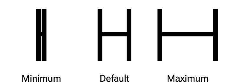
XTRA Parametric Counter Width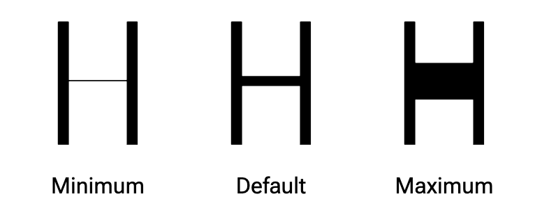
YOPQ Parametric Thin Stroke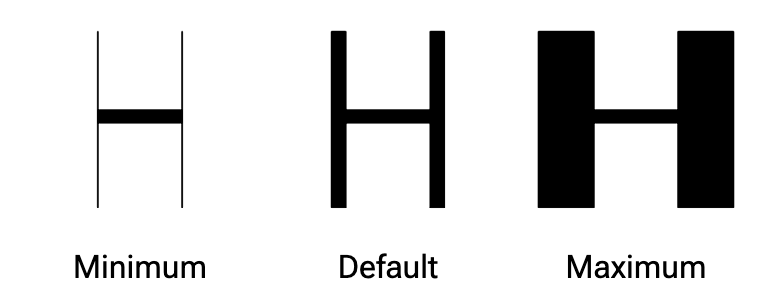
XOPQ Parametric Thick StrokeI recommend these three axes when you start designing a parametric font. All the other axes are optional. You can stick with the main axes, or you can scope them to lowercase letters, ascenders, ink traps, etc. Remember, the main takeaway is that a parametric axis controls some aspect of the font.
When you are ready to learn more axes, continue2 with YTUC, YTLC, YTAS, YTDE, and YTFI. Finally, explore Type Network’s Variation Guide3 when you are no longer afraid of four-letter acronyms.
You can create and name your own custom parametric axes. Just remember, custom axis tags must start with an uppercase letter, use only uppercase letters or numbers, and be exactly four characters long.
With these parametric axes and avar2, you can build common user-facing axes like width, weight, and optical size that are derived from your combinations of parametric axes.
Approaches
David Berlow
David Berlow is the godfather of variable fonts and pioneered the technique. For a deeper dive, watch his conference talks about parametric fonts on YouTube. His approach uses dozens of fine-grained axes to create parametric fonts. David has documented the axes he uses in Type Network’s Variation Guide4; you can see the actual masters in the sources of fonts like Roboto Flex5. For reference, univars are sources that only cover single-axis extremes, duovars dual-axis extremes, and so on. With parametric fonts, it is best to stick with univars when possible. Often, designspace fences restrict ugly or broken areas. By using many axes, the font is extremely expressive, and designers can select options that are normally the purview of the type designer.
Marc Foley
Marc Foley updated the Crispy font6 to use avar2 and employs his own techniques for designing parametric fonts. Rather than having dozens of axes, Marc focuses only on the XTRA, YOPQ, and XOPQ axes. He uses eight masters at the corners of the designspace. This approach requires drawing more corner masters rather than interpolating them; more masters means a larger file size. However, drawing the corner masters ensures that all the designspace interpolates well; good interpolation means no need for designspace fences.
Conclusion
There is no right or wrong approach to parametric variable fonts. Use whichever method works best for you, or create your own.