History
To better understand avar2, we need to learn more about the history and evolution of variable fonts.
Avar2 extends the OpenType1 format for variable fonts2. To better understand avar2, we need to learn more about the history and evolution of variable fonts.
While we focus on the pieces related to variable fonts, I encourage you to read additional articles and books to learn more about other aspects of type design history, such as the foundations of calligraphy, the making of metal type, phototypesetting, and more.
Calligraphy
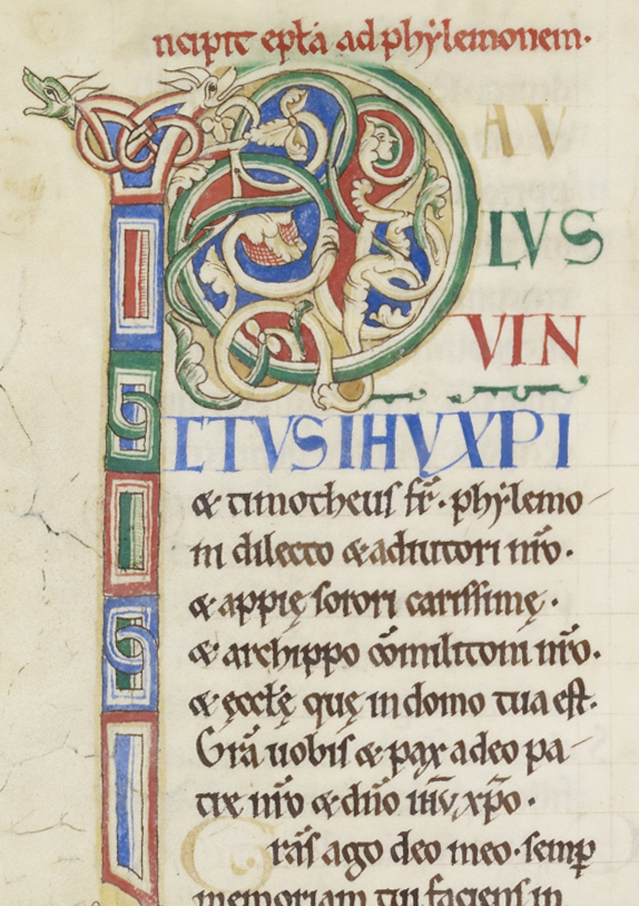
This leaf from the Rochester Bible circa 1135AD is a beautiful example of calligraphy in multiple styles, colors, sizes, and layouts.
Before the invention of typography, text was reproduced through handwriting. While movable metal type resulted in a limited set of predefined letter forms (though early printers did use some variants), handwriting allowed for an in principle unlimited range of adaptable variants. This flexibility enabled scribes to control elements like letter combinations and line lengths with great precision. For example, in contrast with movable type (both analog and digital) what scribes achieved by adapting letter forms, typographers must manage through more rigid kerning pairs.
However, overall control over layout was much more complex for scribes than for typographers, especially since character widths were standardized and unitized at the beginning of movable type. While writing offered greater flexibility with letter forms, typography allowed a more detailed control over the layout. As for OpenType, it does offer the possibility to include many variants as contextual alternates, but one could argue that handwriting still offers more freedom in terms of adaptability.
Punchcutting
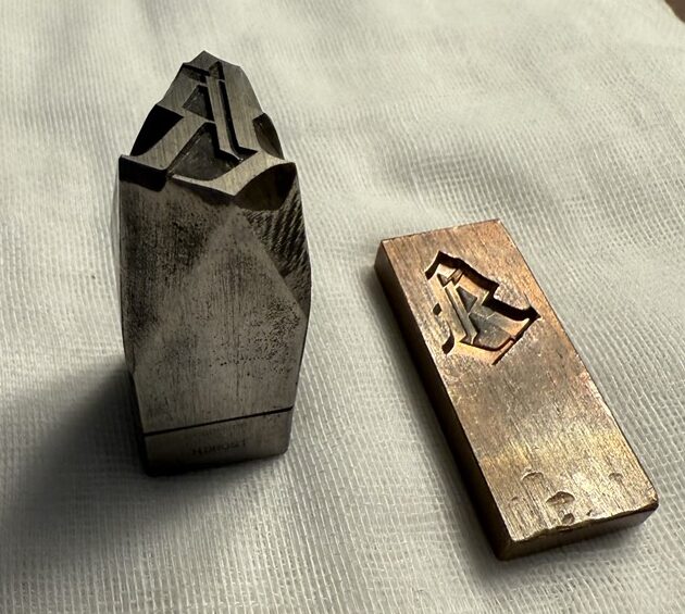
A steel punch and the copper matrix from the Library of Congress’3 Rosenwald Collection4.
Gutenberg's first metal type resembled the written textura quadrata, a style familiar to readers in the northwest of Europe. Since punchcutters created each metal letter in a specific size, weight, and style, they could fine-tune each letter for its particular use. Occasionally, they customized the metal type by shortening descenders or adjusting the x-height relative to the accompanying capital letters (which could have been cut by a different punchcutter). However, scaling did not necessarily require altering the relevant models; the required increase in weight and decrease in contrast (visible in print) were the result of the ink squash, an effect that punchcutters anticipated and relied upon.
The Pantograph
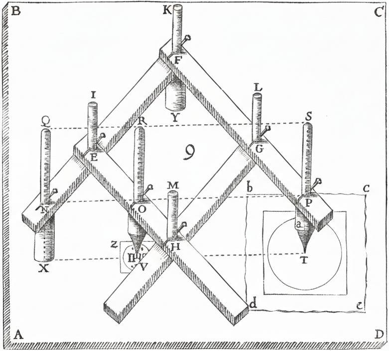
A diagram of Christopher Scheiner’s pantograph.
Christopher Scheiner5 was a Catholic German Jesuit priest, physicist, and astronomer. In 1603, he invented the first copying machine, which he coined the pantograph6. By tracing the original composition with a pen, the machine would mirror the movements with a second pen to create a copy.
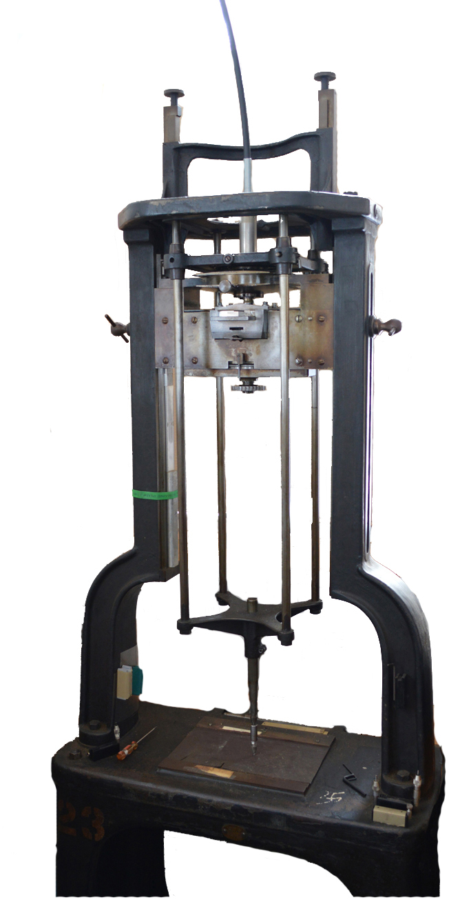
A photo of the Benton Pantograph, provided by Ed Rayher and Swamp Press.
Linn Boyd Benton was an American typeface designer and inventor. In 1884, he invented the Benton Pantograph7, which traced large type design drawings and engraved matrices for metal type for printing. While the invention revolutionized type design and made the skill of the punch cutter obsolete8, it was difficult to predict how a letter would look in small sizes.
The pantograph did more than just trace a letter. It could change the size of the letter. It could compress or expand the width and height of the letter. It could slant the letter at an angle. Depending on the engraving tip, the pantograph could give the letter a stroke to make it slightly bolder. Type designers used the pantograph to create font families from a single source for most letters. Eventually, hot metal type took over by automatically casting and typesetting new metal type for each print job.
Phototypesetting
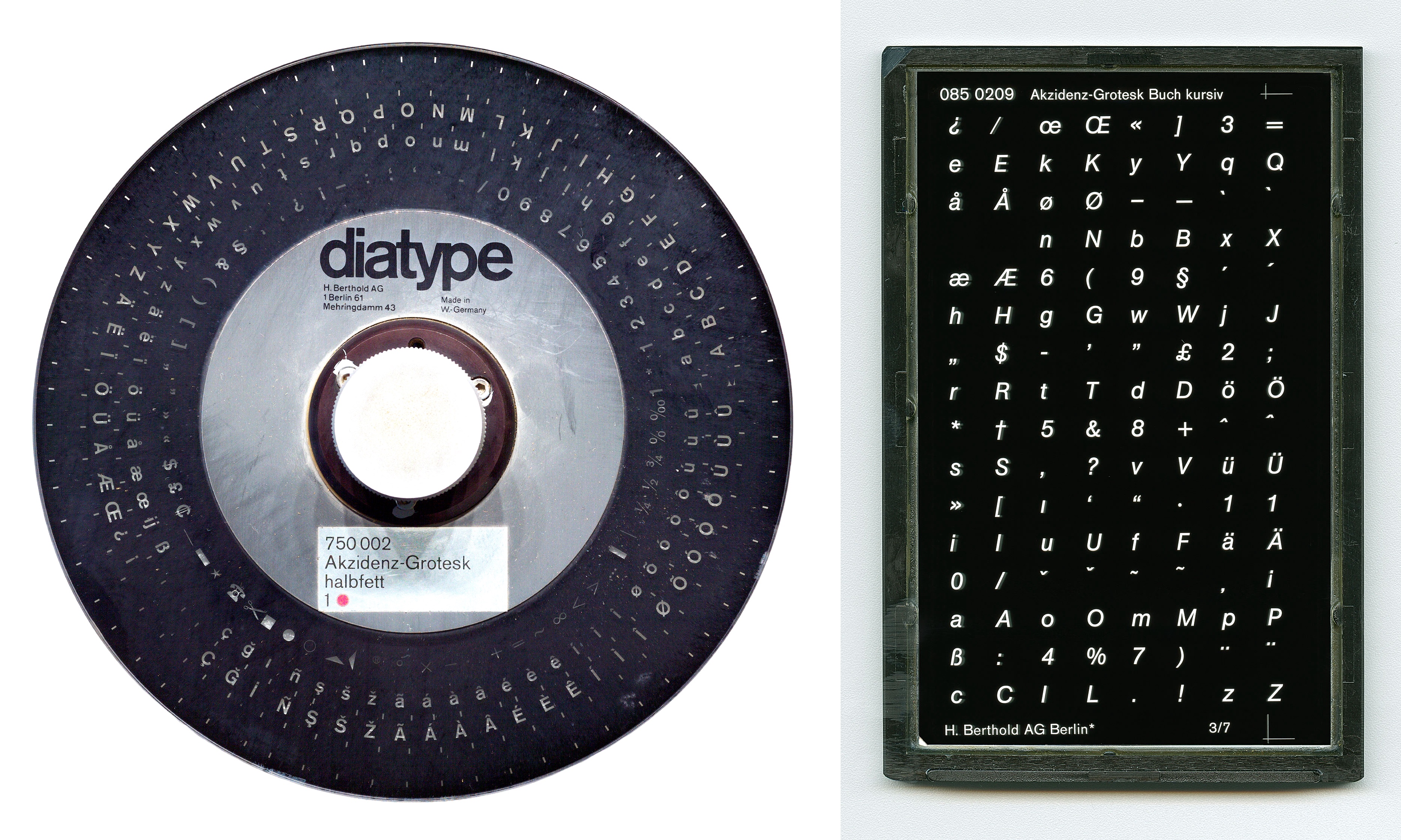
Photos of Akzidenz-Grotesk diatype disc (left) and diatonic plate (right) used for phototypesetting in the 1980s, provided by Dr. Christian Mathieu, Kerstin Wallbach, Dr. Dan Reynolds, C. Kirchner, the German Museum of Technology Berlin Foundation (STDB), and the Berlin State Library.
For a short period, phototypesetting9, or cold type, was faster, cheaper, and offered more options. Its smaller size meant it could fit in offices10. Phototypesetting11 projected light through letters onto photosensitive paper, which was used in offset printing12. Early machines stored letters on font discs or filmstrips; they came in multiple styles, like italic and bold. Lenses were used to change the size of fonts. Later, Cathode Ray Tube (CRT) and Laser typesetting stored fonts as digital data on floppy discs and offered a continuous range of font sizes. Phototypesetting saved money and time by avoiding size-specific adjustments in fonts13. Similar to the pantograph, phototypesetters could transform fonts, such as creating fake italics14. Shortly afterwards, digital type design took over.
Ikarus
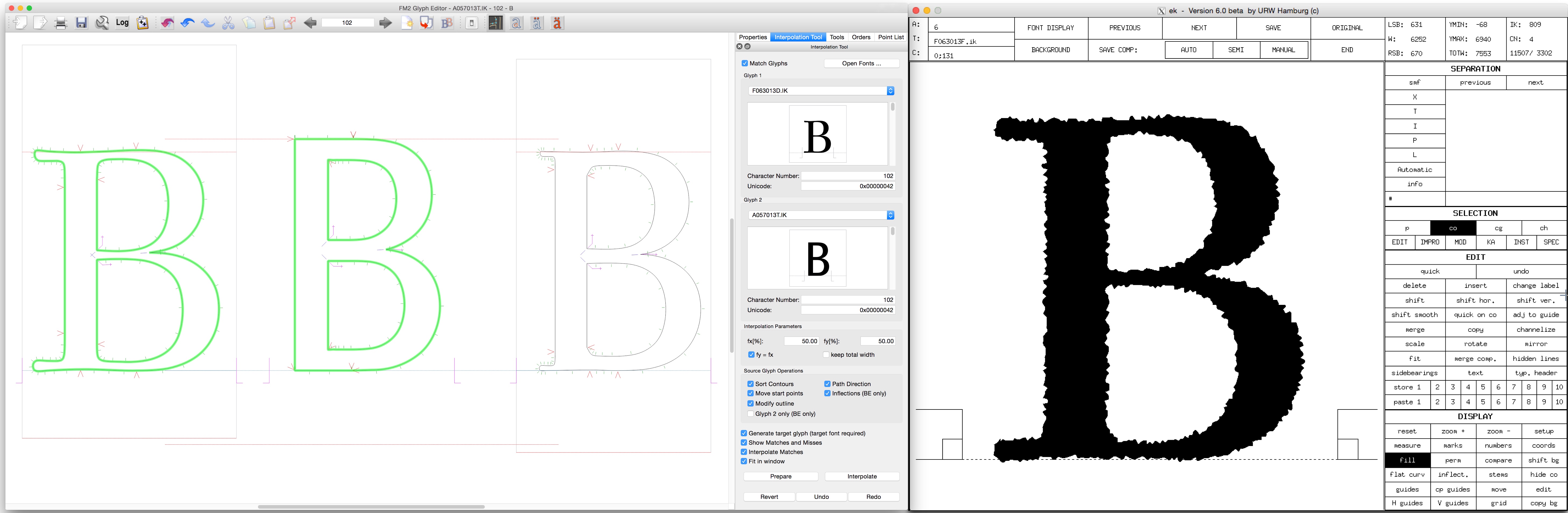
Screenshots of the Ikarus system showing “intelligent” interpolation on the left and “antiquing” on the right. Provided by Dr. Frank E. Blokland and the Dutch Type Library.
In 197215, Dr. Peter Karow16, co-founder of the URW company in Germany17, developed the Ikarus system and format. Ikarus contributed many advancements to digital font technology18.
Ikarus was the first industry standard for digital font data, based on curves instead of pixels. In addition, it could interpolate between light and bold letters with any number of points using “intelligent” interpolation. Ikarus could also use “antiquing19” to add effects like shadows, outlines, and distortions.
Metafont
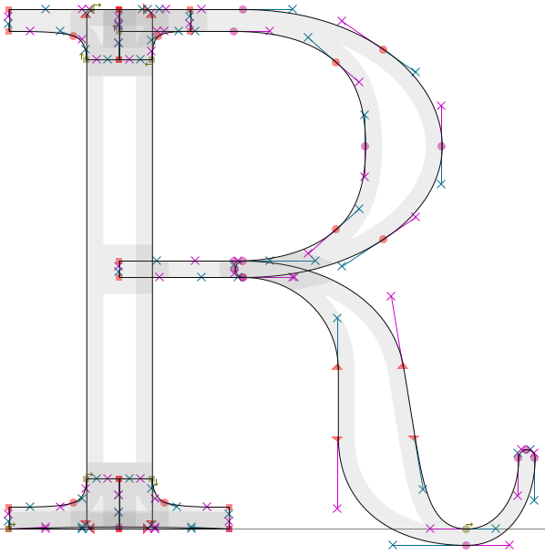
Metafont letter R provided from the mf2ff GitHub repository.
Also in 1972, Dr. Don Knuth, a Stanford University professor, developed Metafont20. Rather than defining a letter using its shapes and outlines, he used computer code to change letters depending on the input design parameters. By writing these instructions, it is possible to generate many variations from a single letter specification. The goal is that the letter will adapt to the inputs appropriately according to the equations in the code.
Unfortunately, Metafont failed21 to become mainstream since it required artists to become computer programmers and mathematicians as well. In addition, Metafont operated on the assumption that letters have skeletal forms that are filled out by pen strokes, which is not the case for all fonts. Nonetheless, Metafont’s concepts apply to modern parametric fonts and variable fonts.
Adobe Multiple Master (MM)
Multiple Master example where the red and blue letters are masters in the extremes of the designspace that the type designer draws.
In 1991, Adobe announced Multiple Master fonts as an extension of its PostScript font format. Similar to Ikarus, Multiple Master fonts interpolate between masters. By drawing masters at the extremes of the designspace, type designers and their customers can interpolate between them using Multiple Master technology.
For example, a Multiple Master font may have two masters, one for the light weight and another for the bold weight. These masters are at the two extremes of the weight axis. Everything in between is the designspace. Using interpolation, the computer could average them together to create any desired weight (e.g. instances such as Regular, Medium, Semi-bold) in between the extremes. Multiple Master fonts never caught on for several reasons.
First, the font instances usually had to be generated from the masters using a separate application22, like Adobe Type Manager. These generated fonts often had the axis values embedded in their filenames23 (e.g. GaramMM Bol_700 wt 470 wd 24 op). During the Font Wars, Apple and Microsoft developed their own TrueType fonts as an alternative to Adobe’s PostScript fonts. As a result, computer operating systems never fully supported Multiple Master PostScript fonts.
Second, Multiple Master fonts required a master to be designed for each corner or extreme of the designspace. For each axis in the design, the number of masters has to be squared, also known as the n^2^ problem. For a font with weight and width axes, Multiple Master fonts required 4 masters (or, if including the regular weight, 9 masters). The maximum24 number of masters was 16, limiting the number of axes to 4. Today, designers may end up with 81 masters25 (3^2^^2^), if they use this approach to design masters for the regular weight and all corners of their designspace for width, weight, and optical size axes.
Ultimately, as the Font Wars ended, Adobe focused on its collaboration with Microsoft on OpenType fonts. The complexity of Multiple Master fonts meant that including them in the OpenType specification would hinder OpenType font adoption26. Outside of Adobe’s apps, developers rarely used Multiple Master technology, as third-party app competition limited Adobe’s outreach. With low adoption of Multiple Master fonts, Adobe eventually deprecated and abandoned the format to focus on other technologies.
Apple TrueType GX
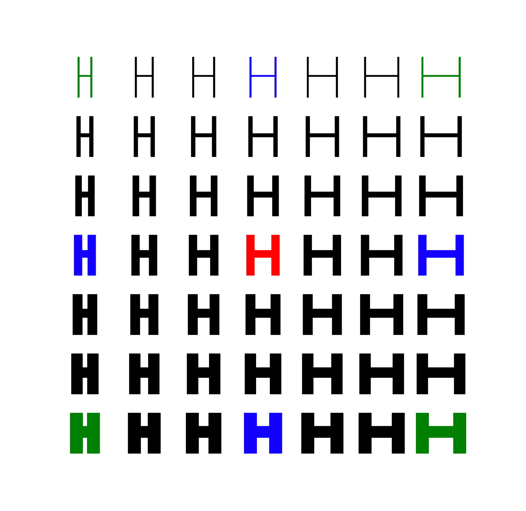
Variable font example where the red and blue letters are masters that the type designer draws, while the green letters are masters that the computer automatically generates with interpolations.
In 1991, Apple introduced TrueType GX variations as part of its overhaul27 of the Mac graphics system. While Apple developed TrueType GX fonts independently28 at the same time as Adobe’s Multiple Master fonts, Apple used a different approach.
First, there was no limit on the number of masters or axes. Type designers could choose any number and type of axes they wanted, so long as they were interpolable.
Second, the interpolations were based on deltas29, which are the mathematical instructions of where to move the glyph outline’s points relative to the base glyph. The font stored a single set of base glyph outlines and the deltas of the other masters. For example, the font may store the light weight’s glyphs, and the deltas of where to move the points for the bold weight. By using deltas, type designers no longer had to design all the corners of a designspace, and the font’s file size was smaller. Given separate condensed and bold versions of a font, TrueType GX could automatically interpolate the condensed bold version. Unlike Multiple Master fonts, type designers did not need to draw and include a condensed bold master. Potentially, this approach would reduce the workload to create font families and save type designers time and money.
Ultimately, Apple’s TrueType GX technology never caught on. Since TrueType GX was Mac-only, developers were worried about compatibility and concerned that their apps would become Mac-only. Implementing the technology in apps would have also required rewriting code. Some apps, like Adobe, had competing alternatives. Finally, type design apps never supported the format. Though later rebranded30 as Apple Advanced Typography, the technology did not catch on because of low usage.
OpenType Variable Fonts (VF)
In 2016, Microsoft announced OpenType 1.831, which added support for variable fonts. Variable fonts are also called font variations. The technology behind OpenType variable fonts is based32 on Apple’s TrueType GX. Although the underlying implementation and tables changed from Apple’s TrueType GX technology, many of the fundamental ideas remain the same.
In particular, OpenType variable fonts interpolate with deltas instead of masters. By using deltas, it is possible to interpolate the extremes of a designspace, rather than having to draw them by hand. Type designers can add intermediate masters and switch shapes for fine-grained control. In addition, deltas are significantly smaller than the equivalent static fonts, allowing them to load significantly faster on the web. These benefits for the web and the collaboration of major companies and type foundries propelled33 OpenType variable fonts to success with wide support.
Avar1 and its Limitations
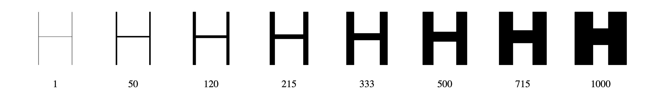
When designing a variable font, axes interpolate linearly by default.
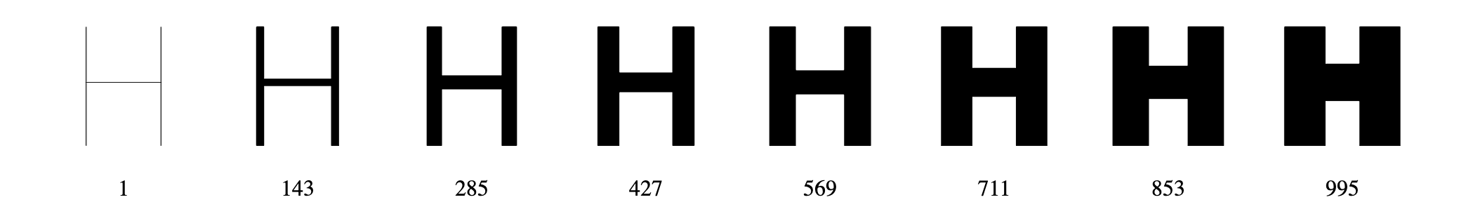
However, linear interpolation is often undesirable34. For weight, optical interpolation means that the bolder the weight, the greater the change in boldness. Conversely, the lighter the weight, the smaller the change in boldness. Notice how the bold weights blend together in linear interpolation, while noticeably growing bolder in the optical interpolation.
The Axis Variations Table, or avar table, is the optional table for variable fonts to define how an axis interpolates across its designspace.
In addition, avar1 supports35 mapping the designspace to the userspace. The most common example is when type designers base the weight axis in the designspace on the letters’ stem width, while exposing common units like 400 Regular or 700 Bold to the userspace for website styling and desktop applications.
While the avar1 table is perfect for fonts with a single axis, it becomes problematic for fonts with more than one axis. When you have width and weight, you may want the change in weight to interpolate differently based on the width. For example, you may need special treatment for the condensed bold weights. For the best interpolation resolutions, axes need to interact36 and be interdependent with each other. Unfortunately, that is not possible with avar1.
Previous Proposals
Although the limitations of the avar1 table were known before variable fonts were released, subsequent proposals failed to add support. All proposals, including Avar2, use OpenType Variations math.
XVAR
In 2016, Microsoft engineer Rob McKaughan proposed37 the xvar table. It introduced a major new table format, which would have required significant effort to implement38. Without demo fonts or implementations, this proposal did not move forward.
ZVAR
In 2018, Microsoft engineer Renzhi Li proposed39 the zvar table. Because of its new terminology and new format requirements, this proposal did not move forward either.
Boring Expansion
The Boring Expansion40 specification is a collection of changes and expansions to font formats. It addresses limitations that have existed for decades and adds desired features. Despite the breaking changes, the fonts are generally backward compatible. The Boring Expansion authors proposed these changes to the ISO OpenFontFormat41, and if accepted, will add them to the OpenType42 specification. We will focus on the proposed avar2 table changes.
Avar2 Proposal
The avar2 table43 improves font variations by supporting cross-axis mapping between hidden and user-facing axes, higher order interpolation, and file size reductions. Google engineer Behdad Esfahbod originally devised the avar2 changes in 2017, formally proposed them in 2019, and demonstrated them in 2022. Support for avar2 continues to grow.
Avar2 is not a separate table; it refers to the avar table format 2. Designspace44 files have added support for avar2 mappings45 as well. On one hand, avar1 mappings only affect a single axis:
<axes>
  <axis tag="wght" name="Weight" minimum="100" maximum="900" default="400">
    <map input="110" output="120"/>
    <map input="600" output="650"/>
    <map input="800" output="780"/>
  </axis>
  <axis tag="wdth" name="Width" minimum="50" maximum="200" default="100">
    <map input="70" output="75"/>
    <map input="120" output="135"/>
  </axis>
</axes>
On the other hand, avar2 mappings can affect multiple axes on both input and output:
<mappings>
  <mapping>
    <input>
      <dimension tag="AX_0" xvalue="800" />
      <dimension tag="AX_1" xvalue="150" />
      <dimension tag="AX_2" xvalue="75" />
    </input>
    <output>
      <dimension tag="AX_0" xvalue="750" />
      <dimension tag="AX_2" xvalue="140" />
      <dimension tag="AX_4" xvalue="140" />
    </output>
  </mapping>
</mappings>
While these examples are in XML, you can visualize them in the Fencer app46 and test their demos47.
This website documents the new avar2 format, showcases avar2 features, and provides examples of how to implement avar2 in your own fonts. For more information on the other features, please see the Boring Expansion specification.
Conclusion
Ultimately, multi-axis font families existed long before digital variable fonts. Avar2 is an important step forward in the digital OpenType format, enabling type designers to enhance their fonts.
Footnotes
-
https://learn.microsoft.com/en-us/typography/opentype/spec/ ↩
-
https://medium.com/variable-fonts/https-medium-com-tiro-introducing-opentype-variable-fonts-12ba6cd2369 ↩
-
https://blogs.loc.gov/bibliomania/2024/12/17/just-my-type-making-letters-at-the-type-foundry/ ↩
-
https://www.loc.gov/collections/lessing-j-rosenwald/about-this-collection/ ↩
-
https://thonyc.wordpress.com/2013/07/25/apelles-hiding-behind-the-painting/ ↩
-
http://www.designhistory.org/Type\_milestones\_pages/Panatograph.html ↩
-
https://www.aepm.eu/publications/conference-proceedings-2/safeguarding-intangible-heritage-passing-on-printing-techniques-to-future-generations/monotype-punchcutting/ ↩
-
https://www.dsource.in/course/digital-typography-1/phototypesetting ↩
-
https://graficnotes.blogspot.com/2017/01/phototypesetting.html ↩
-
https://fonts.google.com/knowledge/choosing\_type/choosing\_typefaces\_that\_have\_optical\_sizes ↩
-
https://www.slanted.de/story/type-essentials-for-graphic-designers-part-ii/ ↩
-
https://www.typefaces.nl/Temporary/Downloads/Twitter/28042019/ATypI\_2004\_IK-FM.pdf ↩
-
https://simoncozens.github.io/fonts-and-layout/history.html ↩
-
https://simoncozens.github.io/fonts-and-layout/history.html ↩
-
Font Naming Issues ↩
-
https://blog.typekit.com/2014/07/30/the-adobe-originals-silver-anniversary-story-how-the-originals-endured-in-an-ever-changing-industry/ ↩
-
https://www.axis-praxis.org/blog/2016-11-14/6/article-gx-variations-a-typographic-revival ↩
-
https://www.monotype.com/resources/articles/part-1-from-truetype-gx-to-variable-fonts ↩
-
https://learn.microsoft.com/en-us/typography/opentype/otspec180/ ↩
-
https://learn.microsoft.com/en-us/typography/opentype/spec/otvaroverview\#introduction ↩
-
https://medium.com/variable-fonts/https-medium-com-tiro-introducing-opentype-variable-fonts-12ba6cd2369 ↩
-
https://learn.microsoft.com/en-us/typography/opentype/spec/ ↩
-
https://github.com/harfbuzz/boring-expansion-spec/blob/main/avar2.md ↩
-
https://github.com/fonttools/fonttools/tree/main/Doc/source/designspaceLib ↩
-
https://fonttools.readthedocs.io/en/latest/designspaceLib/xml.html\#mappings-element ↩