Fences
Prevent users from choosing ugly or broken areas of the designspace.
When designing a font family, the type designer can choose from a wide range of options, from traditional font families with width and weight axes to parametric fonts with dozens of axes. The type designer must design and account for more areas in the designspace than ever before.
Unfortunately, various areas in the font’s designspace fail to meet the type designer’s expectations during interpolation. Type designers may be unable to fix some areas or purposefully omit other areas of the designspace. In these cases, the designspace may have areas that look ugly or broken.
Fence Examples
We will examine historical and modern examples of cases where fences are used to restrict portions of the designspace in order to maintain quality.
Historical Example
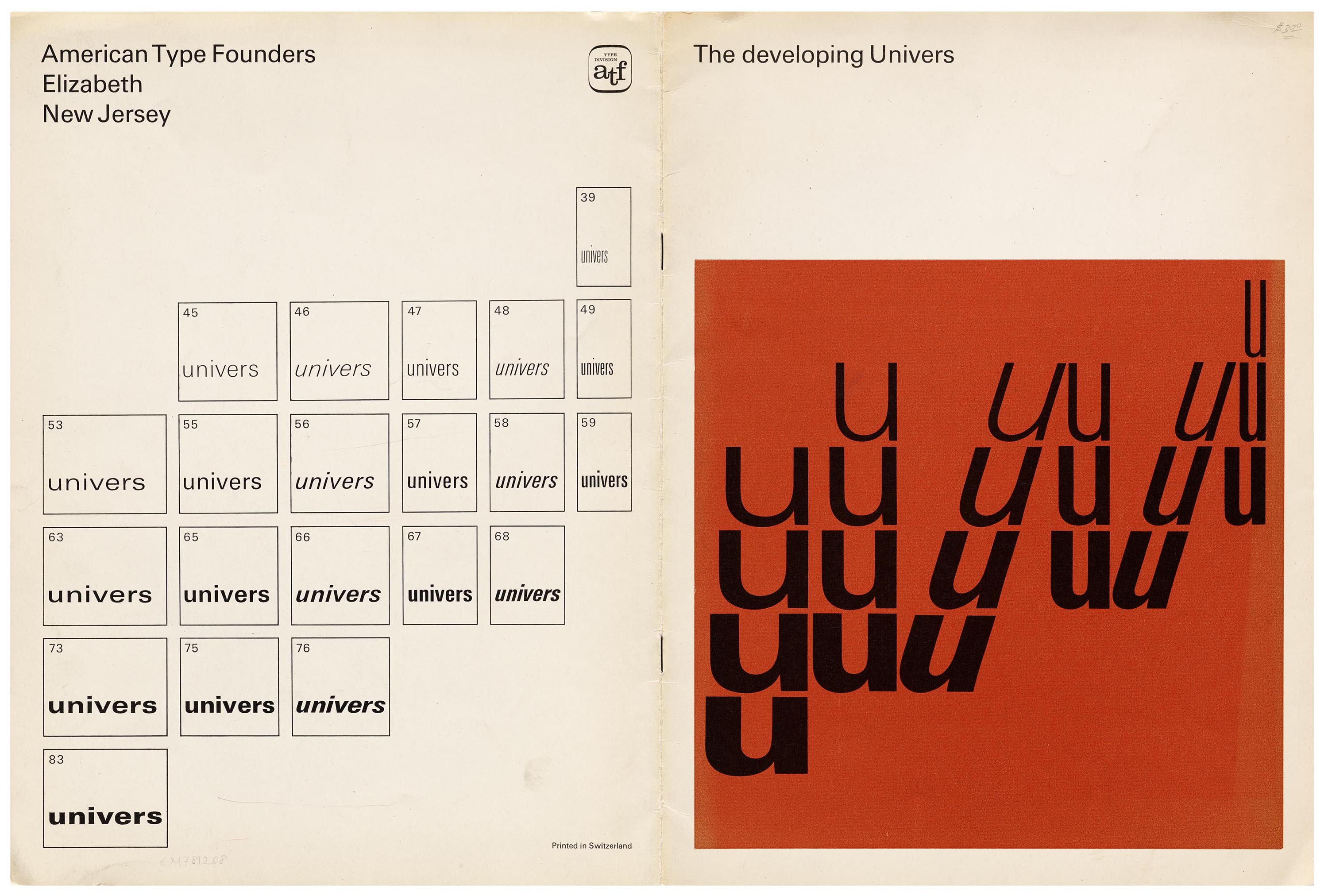
This type specimen from the Letterform Archive and Internet Archive, designed by Bruno Pfäffli and John de Cesare, shows how Adrian Frutiger’s Univers font family omits areas of the designspace.
One of the most famous examples of designspace fences is Adrian Frutiger’s Univers font. He purposefully omits two corners of the designspace—condensed extra bold styles and expanded extra light styles.
Modern Example
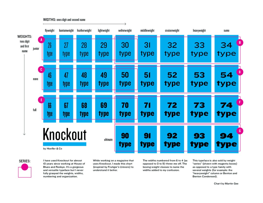
This chart, provided by Martin Gee, helps us understand Hoefler&Co.’s Knockout font family.
Although the type foundry sold the font family in multiple series, their relationships within the font family may be unclear until visualized in this table. Here, we can see how the Knockout font family groups fonts into series and how each series relates to each other. Similarly, Hoefler&Co. omitted portions of the designspace for the condensed extra bold styles.
Broken Designspaces

If you choose the maximum or minimum values for certain axis combinations, you may discover portions of the designspace that appear to break.
Parametric fonts may have dozens of axes, and not all axes interpolate well together. Even the beautiful and groundbreaking Roboto Flex font1 by David Berlow has areas of the designspace that appear broken.
Avar2 Fences
Type designers can easily omit areas of the designspace with static fonts. With variable fonts, it is now possible to restrict designspaces with avar2. For example, you can now restrict the area of the designspace for condensed extra bold styles. This method works well for both parametric and variable fonts.
Here is an example of avar2 mappings that restrict the condensed extra bold corner of the designspace:
<?xml version='1.0' encoding='UTF-8'?>
<designspace format="5.2">
  <axes>
    <axis tag="wght" name="Weight" minimum="1" maximum="1000" default="400"/>
    <axis tag="wdth" name="Width" minimum="50" maximum="150" default="100"/>
    <axis tag="opsz" name="Optical size" minimum="6" maximum="144" default="16"/>
    <mappings>
      <mapping>
        <input>
          <dimension name="Weight" xvalue="1000"/>
          <dimension name="Width" xvalue="50"/>
        </input>
        <output>
          <dimension name="Weight" xvalue="700"/>
          <dimension name="Width" xvalue="50"/>
        </output>
      </mapping>
      <mapping>
        <input>
          <dimension name="Weight" xvalue="1000"/>
          <dimension name="Width" xvalue="75"/>
        </input>
        <output>
          <dimension name="Weight" xvalue="700"/>
          <dimension name="Width" xvalue="75"/>
        </output>
      </mapping>
      <mapping>
        <input>
          <dimension name="Weight" xvalue="700"/>
          <dimension name="Width" xvalue="50"/>
        </input>
        <output>
          <dimension name="Weight" xvalue="700"/>
          <dimension name="Width" xvalue="50"/>
        </output>
      </mapping>
      <mapping>
        <input>
          <dimension name="Weight" xvalue="700"/>
          <dimension name="Width" xvalue="75"/>
        </input>
        <output>
          <dimension name="Weight" xvalue="700"/>
          <dimension name="Width" xvalue="75"/>
        </output>
      </mapping>
      <mapping>
        <input>
          <dimension name="Weight" xvalue="1000"/>
          <dimension name="Width" xvalue="75.02"/>
        </input>
        <output>
          <dimension name="Weight" xvalue="1000"/>
          <dimension name="Width" xvalue="75.02"/>
        </output>
      </mapping>
    </mappings>
  </axes>
</designspace>
Setting only the first two mappings will fence off this corner of the designspace, but may unexpectedly distort other areas of the font’s designspace.
Setting all the mappings will fence off this corner of the designspace without distorting other areas.
Experiment with the example mappings to see how they interact with the designspace using the Fencer app2. In the latter example, some mappings have the same input and output to avoid distorting other areas in the designspace; these mappings are called pin mappings.
The last mapping has a 0.02 difference because mappings cannot start at the same location. The smallest increment that is possible, also called the epsilon value, is 1 in normalized coordinates / 2^14^ or 1/16384. In this example, we arbitrarily chose 0.02 instead.
The order of the mappings within the XML code does not matter. Finally, if you have other designspace distortions, you will need to add additional mappings to avoid unexpected distortions around the fences.
The Python3 library fontTools can merge3 your designspace definitions into your font with a post-build script, if your type design app does not yet support avar2.