Designspace Distortion
Support axis interdependence for better interpolation to accurately match the type designer’s intentions and remove duplicated axes.
Designspace Mapping to Userspace
Avar1 supports1 mapping values from the designspace to the userspace. The designspace is the range between the two extremes of an axis, e.g. light and bold weights. The designspace coordinates can be set to any values the type designer chooses. For example, many type designers select the letters’ stem width as the values for the weight axis in their designspace. However, websites and applications have expectations that the Regular weight is 400, Bold is 700, etc. Type designers use the avar1 table to map the userspace values, like 400 and 700, to designspace values in their source files.
Axis Distortions
Variable fonts use linear interpolation for their axes by default.
However, linear interpolation is often undesirable2. For weight, optical interpolation means that the bolder the weight, the greater the change in boldness. Conversely, the lighter the weight, the smaller the change in boldness.
Type designers use the avar1 table to define how an axis should interpolate across the designspace.
Avar1 Limitations
While the avar1 table is perfect for fonts with a single axis, it becomes problematic in fonts with more than one axis. For example, when you have width and weight, you may want the change in weight to interpolate differently based on the width. Also, you may need special treatment for the condensed bold weights. For the best interpolation resolutions, axes need to interact3 and be interdependent with each other. Unfortunately, this is not possible with avar1.
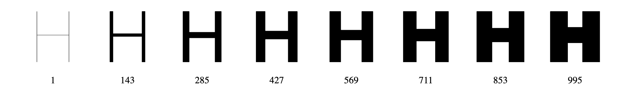
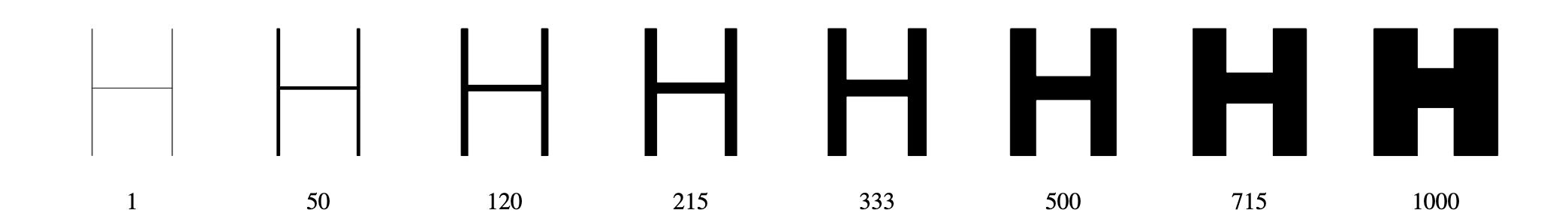
Real-world Examples
Sophia Sans
The Sophia Sans4 font family has weight and width axes. The type designers chose specific points in the designspace for each named instance, like ExtraCondensedBold or SemiCondensedLight. However, when it came time to make a variable font, it was not possible to map those named instances to points that would interpolate on both axes.
As a workaround, the type designers split the font into four variable fonts, so they could align the weight axis specifically for each width. With avar2, the type designers no longer need to split the font, and they can set the distortions directly in the avar2 table.
Visualization of the designspace distortions in Sophia Sans
Calibre
Luc(as) de Groot5 designed the Calibre font family. Microsoft commissioned him to add optical sizes to his font family for the regular weight. Ideally, he would add two additional masters. However, with variable fonts, those optical size masters and their deltas affected the interpolation of his existing designspace. Without avar2, the designspace must be orthogonal, and the only solution was to duplicate 16 masters—“outch”!
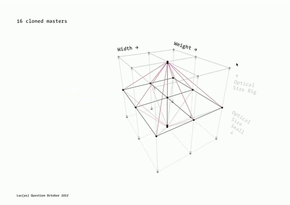
Slide from Luc(as) de Groot’s presentation overlaying the duplicate axes of the orthogonal designspace overtop the designspace he was trying to implement.
With avar2, he can distort the designspace to be non-orthogonal with the points converging towards the optical size masters; full design control without data duplication.