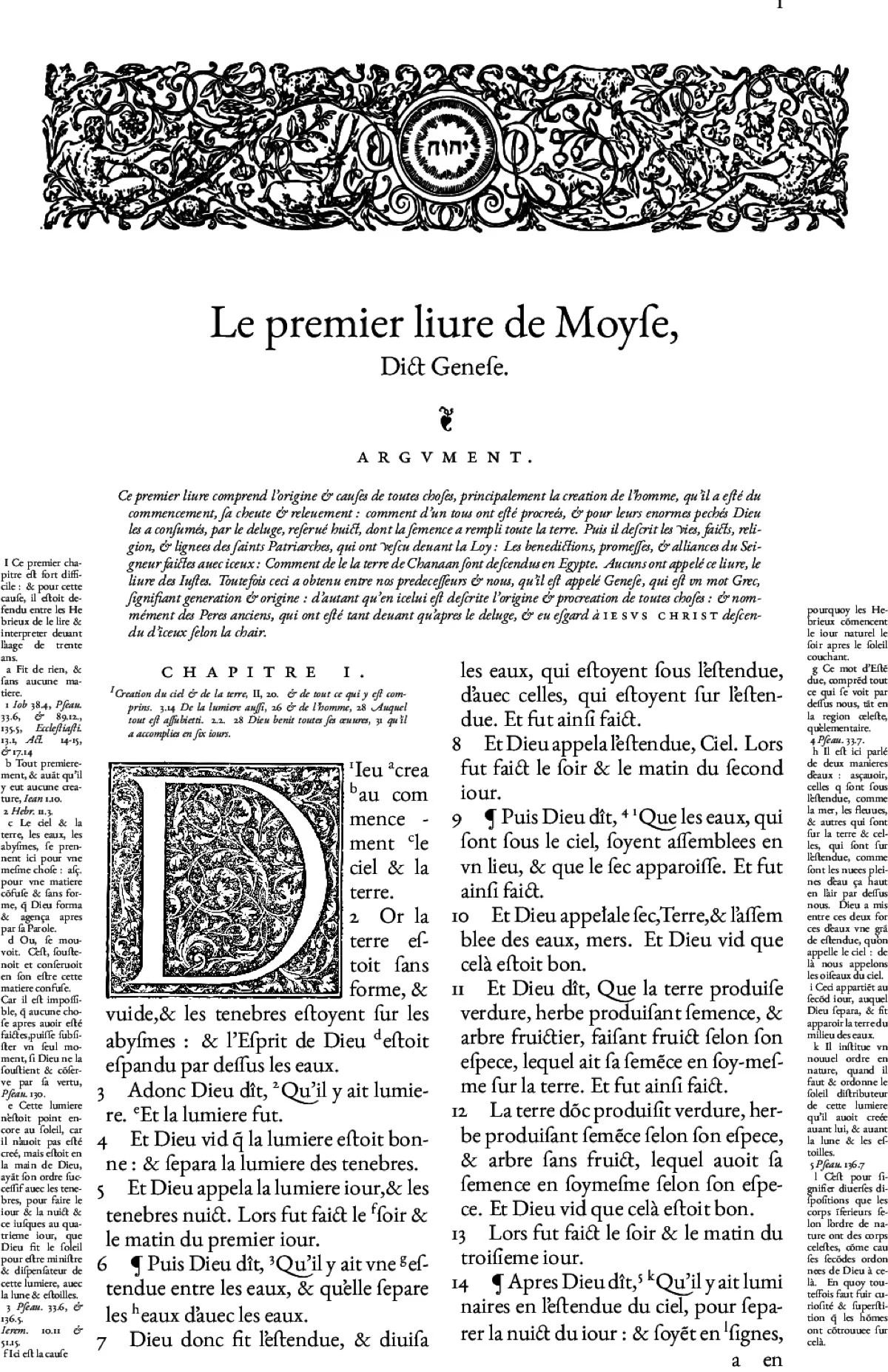
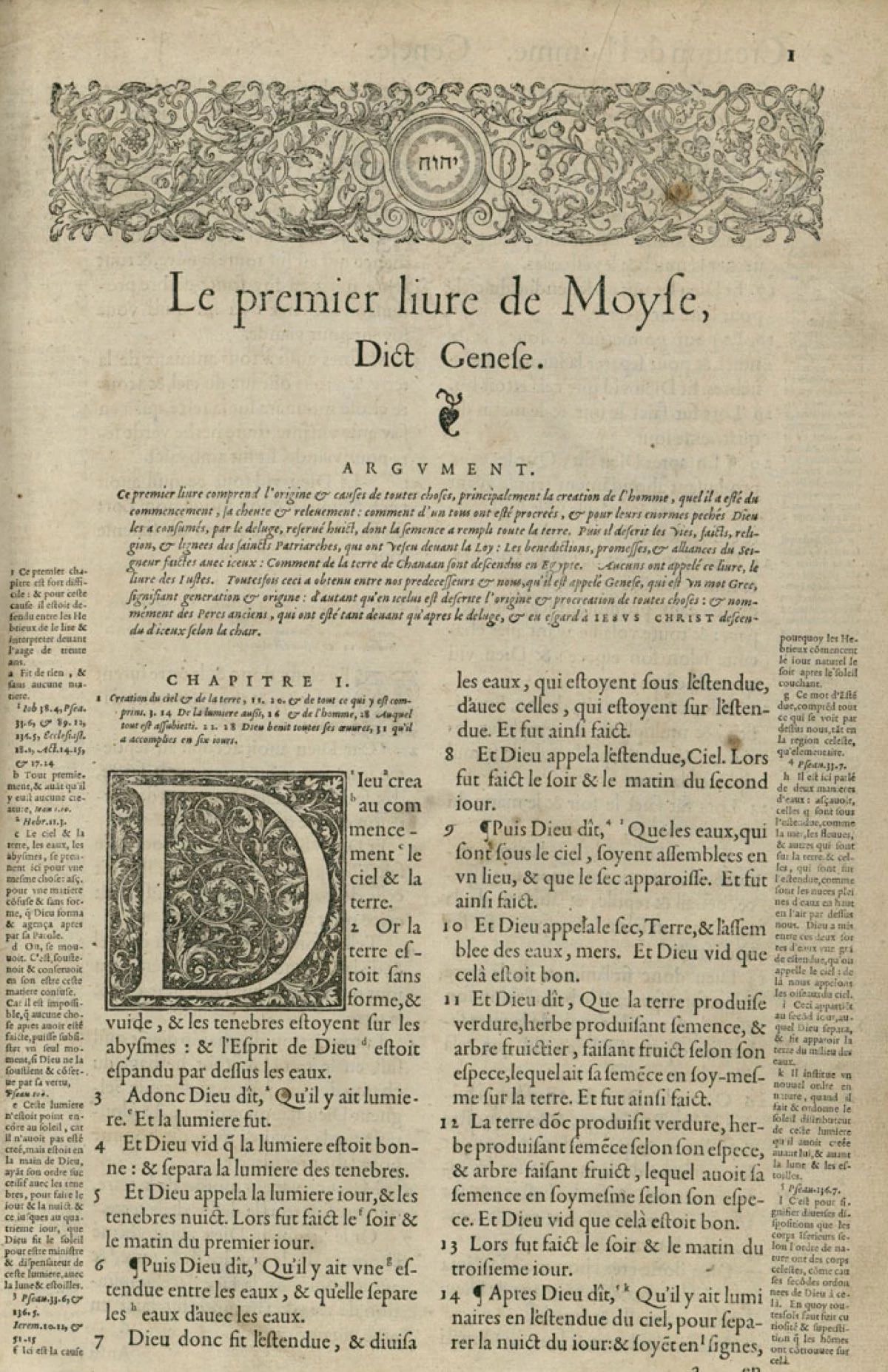
Claude Garamont (c. 1510 – 1561), known commonly as Claude Garamond, was a French type designer, publisher and punch-cutter based in Paris. Garamond worked as an engraver of punches, the masters used to stamp matrices, the moulds used to cast metal type. He worked in the tradition of what is now called old-style serif letter design, that produced letters with a relatively organic structure resembling handwriting with a pen but with a slightly more structured and upright design. Considered one of the leading type designers of all time, he is recognised to this day for the elegance of his typefaces. Many old-style serif typefaces are collectively known as Garamond, named after the designer.
Garamond was one of the first independent punchcutters, specialising in type design and punch-cutting as a service to others rather than working in house for a specific printer. His career therefore helped to define the future of commercial printing with typefounding as a distinct industry to printing books.
Although Garamond himself remains considered an eminent figure in French printing of the sixteenth century, historical research over the last century has increasingly placed him in context as one figure among many at a time of rapid production of new typefaces in sixteenth-century France, operating within a pre-existing tradition defined by the work of figures such as Aldus Manutius active over the preceding half-century. The period from 1520 to around 1560, encompassing Garamond's career as an artisan, was an extremely busy period for typeface creation, with a wide range of fonts created, some apparently for exclusive use by a specific printer, others sold or traded between them. Many engravers were active over this time, including Garamond himself, Granjon, Guillaume Le Bé, Antoine Augereau, Simon de Colines, Pierre Hautin and others, creating typefaces not just in the Latin alphabet, but also in Greek and Hebrew for scholarly use. This period saw the creation of a pool of high-quality punches and matrices that would supply the French printing industry, to a large extent, for the next two centuries.
Visit: https://en.wikipedia.org/wiki/Claude_Garamond